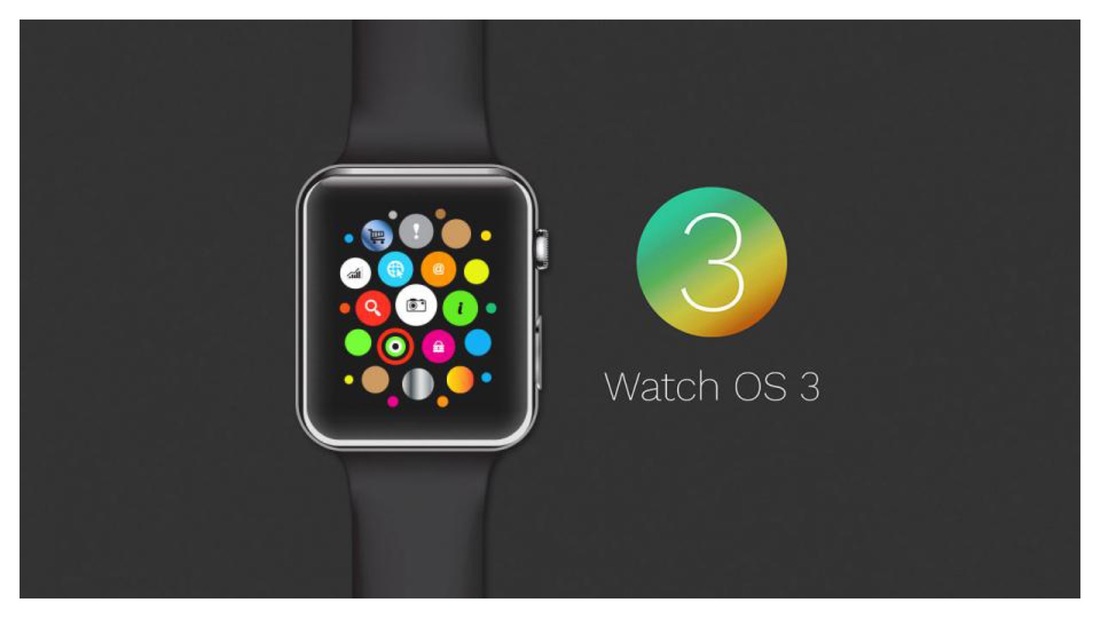
So if I want to launch my favorite podcasting app, Downcast. I have two options.
1. Hit the crown
2. Hit the Downcast app bubble
Or…
1. Hit the App Launcher Button
2. Swipe right
3. Swipe right
4. Swipe right
5. No wait, it must’ve been to the left
6. Swipe left
7. Swipe left
8. Swipe left
9. Swipe left
Get the picture? Too many touches.
With speed being equal between the home screen and the app launcher, I don’t see why anyone would ever want to use the app launcher. Unless you’re actually wanting to use it as a glance, so you see some kind of information quickly (now improved with the background refresh). But that brings us full circle back to glances. Apple could’ve just added background refresh to Glances and used the friends side button for something else.
I don’t have any background in user interface design, so I’m approaching this issue strictly from the efficiency aspect. For me, hitting the crown and selecting my desired app is the hands-down quickest way to get to where I want to go. I suppose for those who may have eye-hand coordination issues, they now have the option of hitting the app launcher and swiping to their desired app.
The speed increase can be dramatic compared to the old Watch OS. I was sitting in the movie theatre earlier today with my kids, and I heard a great song pumping through the sound system. I was afraid to open SoundHound on my iPhone for fear that by the time I fished it out of my pocket and opened the app that the clip would be over. I raised my wrist, hit the crown, and hit SoundHound. Bam! Within about 5 seconds from start to finish, I had the song title displayed on my watch. And I felt a lot less conspicuous doing it on my watch than my iPhone to boot. Some things are better on the watch than the phone, song identification is one of them.
Regardless of which you like better, Watch OS 3 marks a huge leap forward for the Apple Watch in terms of speed and usability. I'm looking forward to increased software refinements and better hardware in the near future.


 RSS Feed