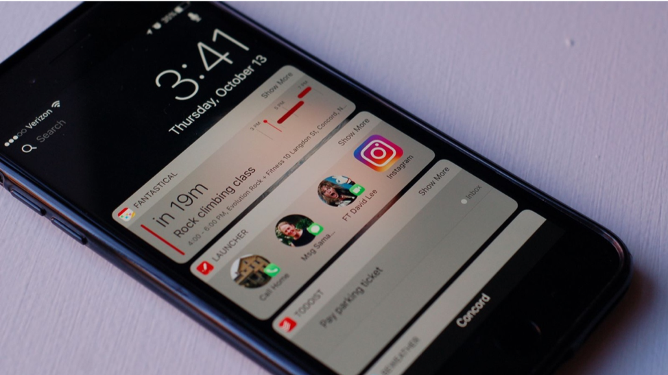
And the setup of the iPhone widget screen is perfectly suited to a watch-sized screen. The iPhone aspect ratio is narrow and long. Which would make it easy to scroll through your widgets on your Apple Watch with the crown.
Complications are great for a quick glance at your watch when you only want the most important information. But the focus is very narrow. You only see one specific stat. Like one stock or one team score.
But there are other times when you’d like to spend more than 3 seconds looking at your watch and don’t want to pull out your iPhone. You want a comprehensive look at your schedule, sports scores, deliveries etc. I’m thinking of times when I’m sitting in church or my wife just got up from the dinner table to fetch something. Pulling out my iPhone would be grossly inappropriate in certain situations due to how that can be interpreted by other people. At those times, I wish my Apple Watch had my iPhone’s widget screen. Especially if my iPhone is in my pocket. In that case, it ‘s much quicker to turn my wrist than it is to dig my iPhone out of my pocket.
An iPhone-esque widget screen on the Apple Watch would allow me to scroll through all my important information with the crown. A complication would only show you one stock price, the widget could show you many. Plus, with the widget, you can scroll through all your info in one fluid motion. With complications, you have to open and close individual apps to get sports scores or delivery updates, etc. That takes a lot more effort and time.
I like Apple Watch complications. I have my gripes with them but overall they serve their purpose well. Which is that I can see a single piece of information at a quick glance without touching my watch. But the Apple Watch also needs an alternate way of aggregating your stuff. A way that gives you more information with only a little more effort. A way that is easier than opening and closing 4 or 5 separate apps. The Apple Watch widget screen is “cross-application” and would be perfect.


 RSS Feed