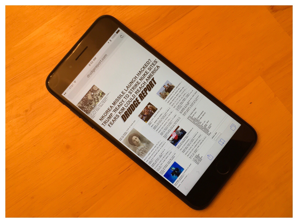
But the drawbacks don’t stop there. There is also the issue of how websites look on a mobile phone screen. Simply put, the web looks better on a wider screen than a narrow one. More horizontal space allows for larger font sizes for your text. Extra vertical space does not. You get more text, but the font size isn’t any larger. The net result is that web pages are much more readable on phones that have a fatter aspect ratio.
Now I will admit that whether you feel websites look better on wide or narrow screens depends somewhat on whether you prefer to look at desktop or mobile versions of a site. And this may depend on how good your eyesight is. I much prefer looking at the full desktop versions. The mobile versions are almost always pared down versions that leave a lot of content out. Mobile sites are easier to read but at the expense of overly large font sizes that require excessive scrolling.
One of the great benefits of the iPhone 7 Plus is that the relatively wide screen makes desktop web sites like the Drudge Report still relatively useable. You can see three columns as opposed to one at a time because the text can be larger. There is no scrolling necessary. If you have good eyesight, wider phones give you the option of maximum information delivery.
I’ve received feedback from Samsung fans since yesterday which has been interesting. None of them dispute the facts of what I’m stating, but they now make the case that the feel of the phone in the hand is so much better with a narrow phone. Oddly, they are now saying that narrow phones are the way of the future.
No, narrow phones that feel good in your hand are a blast from the past. More specifically, 2007-2014 when Apple doggedly stuck to narrow phones in the face of larger Android competition. This battle has been fought and won. Screen usability trumps hand feel.
Android fans all of a sudden have had a change of heart which strikes me as disingenuous. Before when Apple made the case that one-handed usability was important and Samsung didn’t care, the Android fans said that Apple was stuck in the past. Now, all of a sudden one-handed usability is important because Samsung says so? Screen real estate is now second fiddle?
Narrow vertical aspect ratios are a mistake. Foldable phones are right around the corner. So moving web developers wholesale to displaying info on a grocery-receipt–sized screen is ridiculous when we’ll be asking them to move back to wider aspect ratios a little later.
And mark my words, when Samsung comes out with foldable phones and shows the benefits of an expansive wide screen, the Samsung fans will be saying that narrow aspect ratios are dumb relics of the past.


 RSS Feed